InsightsLanding page design
Landing Page Design: The Framework for High-Converting Pages in 2026
The anatomy of landing pages that consistently convert paid traffic into leads and sales — with design principles, copy frameworks, and trust-building elements backed by 2026 data.
17 January 202627 min read
Direct answer
A high-converting landing page follows a specific structure: a benefit-led headline above the fold, a value proposition under 30 words, three to five proof points, testimonial social proof, a single primary CTA, and a form with three fields or fewer. Pages with a single focused offer convert at 3–5× the rate of homepage-directed campaigns, per Involve Digital's analysis of 100+ NZ paid search accounts. The most impactful conversion variable is message match: the degree to which the headline mirrors the ad or query that brought the visitor. Every additional navigation link or secondary offer reduces conversion rate: the page's only job is to convert the specific visitor the ad was written for. — Involve Digital, conversion design specialists
Landing Page Design: The Framework for High-Converting Pages in 2026
You're spending money on Google Ads or Meta campaigns, driving traffic to a page, and watching most of it evaporate. The industry median landing page conversion rate sits at 6.6% across all industries — yet the top 25% of pages convert at over 10%, and the bottom 25% convert below 3%. That's a 3x performance gap driven almost entirely by design and optimisation decisions, not traffic quality. For most businesses running paid campaigns, the landing page is where ROI is won or lost.
This article is part of Involve Digital's complete website design and build guide — a series covering every layer of what makes a business website drive revenue. Here we go deep on the specific art and science of landing pages: the pages your ads point to, the pages your prospects judge you by in the first three seconds, and the pages that determine whether your campaign budget compounds into leads or disappears into bounce rates.
Why Most Landing Pages Underperform
The most common landing page mistake isn't a design problem — it's a strategy problem. 77% of businesses send paid ad traffic to their homepage rather than a dedicated landing page. A homepage tries to serve every visitor with every intent: existing customers, job seekers, investors, partners, and prospects at every stage of the funnel. A landing page has one job: convert a specific type of visitor arriving from a specific ad with a specific intent into one specific action.
The second most common mistake is mismatched messaging. When someone clicks an ad that says "Free Website Audit for NZ Businesses" and arrives at a page that says "Digital Marketing Services," you've created cognitive friction at the precise moment the visitor is most likely to convert. Message match — the alignment between ad copy and landing page headline — is one of the highest-leverage variables in conversion rate. Studies consistently show that tight message match between ad and landing page lifts conversion by 20–40%.
The third mistake is too many options. Landing pages with multiple offers or CTAs convert 266% lower than those with a single focused call to action, according to Unbounce data from over 41,000 landing pages. Every additional link, navigation menu item, or secondary offer you add increases decision paralysis and decreases conversions. The paradox of choice is real, and it's costing businesses significant revenue.
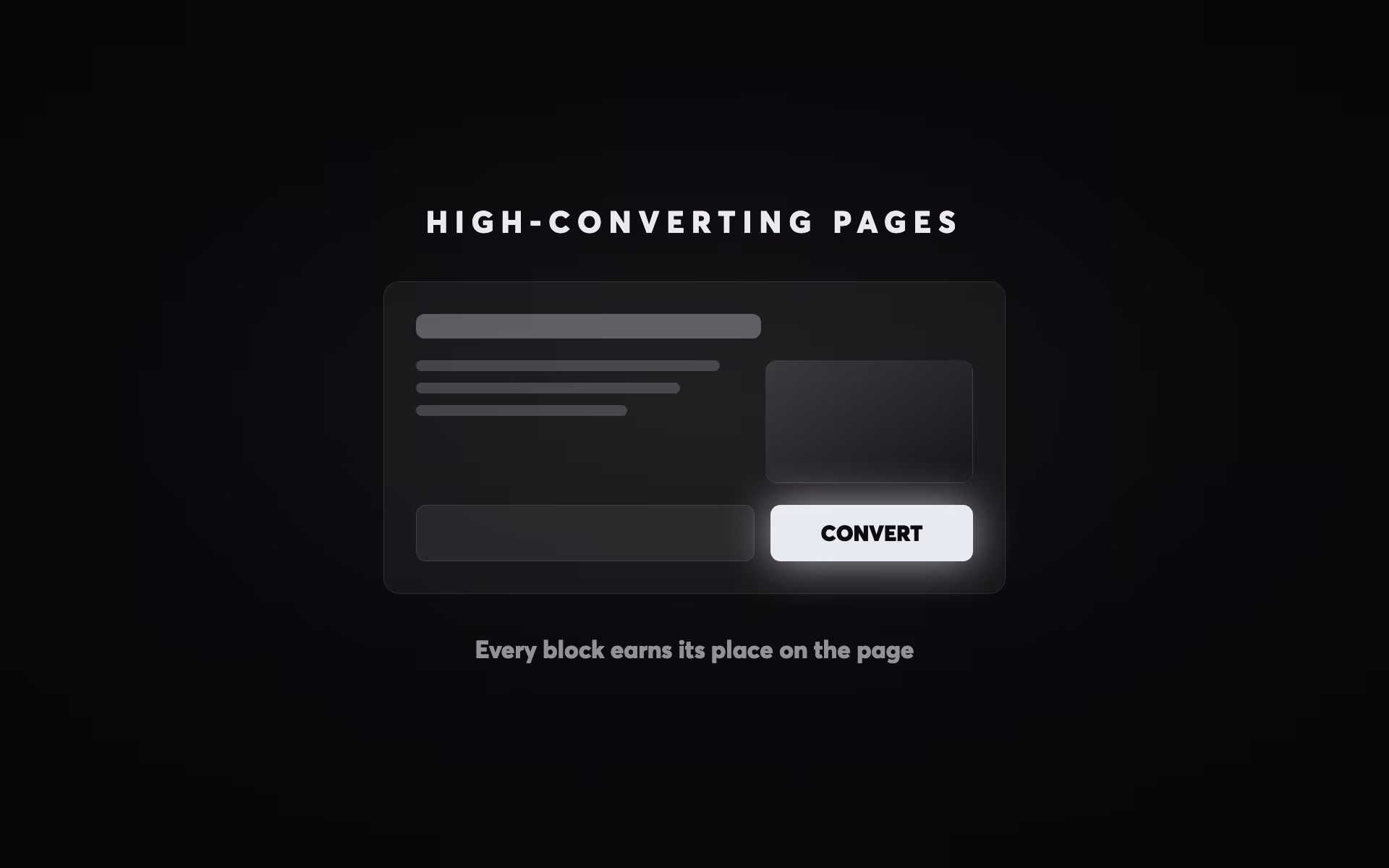
The Anatomy of a High-Converting Landing Page
A high-converting landing page follows a predictable hierarchy — not because creativity doesn't matter, but because visitor psychology is consistent. People making decisions online follow patterns: they scan before they read, they look for social proof before they commit, and they need friction removed before they act. Understanding this hierarchy lets you build pages that work reliably across different offers and audiences.
Section 1: Above the Fold — Your Three-Second Pitch
The most important real estate on any landing page is what visitors see before they scroll. Research consistently shows that 60% of visitors never scroll past the fold — which means everything above the fold is the only content that 100% of your visitors will see. This section must do four things simultaneously: identify the visitor's problem, communicate your solution, establish credibility, and tell them what to do next.
The above-the-fold hierarchy follows a strict priority order. The headline comes first: a clear, outcome-driven statement that immediately communicates what you do and who it's for. Not clever wordplay. Not your company name. The single clearest expression of the value you deliver. A strong headline improvement alone can lift conversions by 250–300% — more than any other single element on the page.
Below the headline sits the sub-headline: a supporting statement that adds specificity and context. If your headline is "Get More Leads From Your Website," your sub-headline might be "We design and build Webflow websites for NZ professional services businesses — focused entirely on conversion, not awards." The sub-headline does the narrowing work, targeting the right visitor and qualifying out the wrong ones.
The primary CTA sits above the fold and must be impossible to miss. Contrast is more important than colour — your CTA button needs to stand out from every other element on the page. The copy matters too: "Get My Free Audit" outperforms "Submit" because it's specific, benefit-focused, and uses first-person language. Testing data shows that first-person CTA copy ("Start My Free Trial") converts significantly better than second-person ("Start Your Free Trial") — a subtle but measurable difference.
Trust signals belong above the fold, positioned near the CTA. For B2B services, this typically means client logos, a star rating with review count, or a specific social proof statistic ("Trusted by 200+ NZ businesses"). The goal is to answer the visitor's immediate subconscious question — "can I trust this company?" — before they've had time to formulate conscious objections.
| Metric / Industry | Benchmark Rate | Context |
|---|
Section 2: The Value Architecture Below the Fold
Once you've earned a visitor's attention above the fold, the content below the fold must systematically dismantle the reasons they might not convert. The structure that works consistently across B2B services, SaaS, and professional services follows a pain-to-proof-to-process flow: identify the problem they came to solve, demonstrate that you solve it better than alternatives, and show them exactly what happens when they take the next step.
The problem/agitation section validates that you understand the visitor's situation. This is where you name the specific frustration your offer resolves — not in vague marketing language, but in the precise words your customers use. "Most NZ businesses are spending $3,000–$10,000 per month on Google Ads and sending that traffic to a homepage that wasn't built to convert it" resonates more than "We help businesses improve their digital presence."
The solution section presents your offer through benefits, not features. Features describe what your product does; benefits describe what the visitor gets. "Fast page load times" is a feature. "Your visitors stop bouncing and start converting — without you spending more on ads" is a benefit. Every statement in your solution section should answer the visitor's implicit question: "What does that mean for me?"
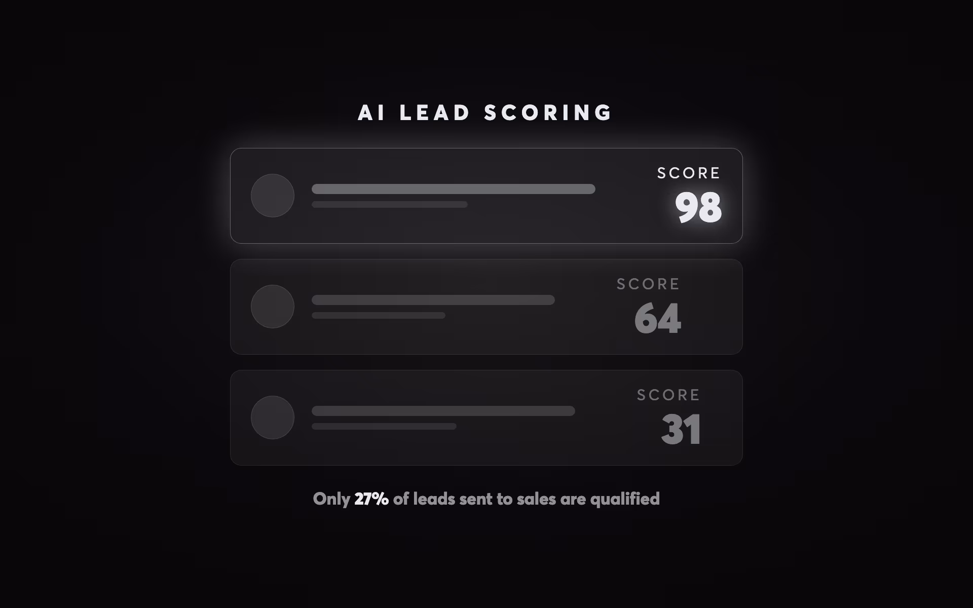
The social proof section is where most landing pages under-invest. 36% of top-converting landing pages include testimonials, and specific, outcome-focused testimonials outperform generic praise by substantial margins. "Involve Digital redesigned our website and our lead volume doubled in the first quarter" is worth ten times "Great team, really professional." Specificity creates believability. Named testimonials with photos outperform anonymous ones. Video testimonials outperform text. Client logos add instant credibility, particularly when they include recognisable brands your target audience respects.
The process section reduces friction by making the invisible visible. People are reluctant to take action when they don't know what happens next. A simple three-step process diagram — "1. Complete our scoping form, 2. We send you a detailed brief within 48 hours, 3. We present your project proposal" — removes uncertainty and dramatically reduces the anxiety that kills conversions at the form stage.
Copy Frameworks That Convert: Writing for Decision Makers
The copy on your landing page is doing selling work that your sales team can't do — it's reaching prospects at scale, 24/7, without the ability to answer follow-up questions in real time. That means your copy must proactively address objections, communicate value with precision, and guide the reader toward a decision without ever feeling pushy.
The PAS (Problem-Agitate-Solution) framework is the most reliable structure for landing page copy. Start by naming the problem with specificity. Agitate by describing the consequences of leaving that problem unsolved — lost revenue, wasted time, competitive disadvantage. Then present your solution as the logical resolution. This framework works because it matches the reader's mental journey: they're on your page because they have a problem, and they're evaluating whether you can solve it better than alternatives.
The AIDA framework (Attention-Interest-Desire-Action) maps directly to landing page structure: your headline captures attention, your value proposition creates interest, your social proof and benefits build desire, and your CTA triggers action. The key is proportionality — most landing pages over-invest in attention and under-invest in desire. Social proof, case studies, and specific outcomes are desire-builders, and they're frequently absent or weak.
Headline formulas that consistently test well in B2B and professional services contexts:
The outcome formula: "[Specific Result] for [Target Audience] Without [Common Objection]." Example: "More Leads From Your Website — Without Spending More on Ads." The contrast formula: "Stop [Painful Current State]. Start [Desired Future State]." The number formula: "[Specific Number] [Target Audience] Have Used This [Offer] to [Achieve Result]." The how-to formula: "How to [Achieve Desired Outcome] in [Timeframe] — Even If [Common Obstacle]."
The 2026 development worth noting: AI-generated landing page copy has demonstrated 37% higher conversion rates than traditionally-written control pages in A/B tests, according to SEO Sherpa's 2026 analysis. This doesn't mean AI replaces strategic thinking — it means AI excels at rapid variation generation, which enables faster, more extensive A/B testing. The winning copy still requires human strategic framing; AI accelerates the testing process.
Trust Signals: The Conversion Accelerator Most Businesses Underuse
Trust is the invisible variable in every conversion decision. A visitor who trusts you converts; one who doesn't, leaves. Yet trust signals are frequently treated as decorative elements — logos scattered at the bottom, a generic "5-star rated" badge — rather than as the primary conversion drivers they actually are.
Reviews can increase landing page conversion rates by up to 270%, according to research from the Spiegel Research Center. The mechanism is simple: social proof reduces perceived risk. When someone is considering spending money or sharing their contact details with an unfamiliar business, seeing that others have done the same — and been satisfied — is the most powerful reassurance available.
The placement of trust signals matters as much as their presence. The highest-impact placement is directly adjacent to your primary CTA — the moment of maximum decision anxiety. A testimonial immediately above your form, a client logo strip immediately below your headline, a review count inside your CTA button text ("Join 400+ NZ Businesses — Get Started") — these micro-placements have measurable effects on conversion rates.
For B2B landing pages, the hierarchy of trust signals by effectiveness runs approximately: case studies with specific outcomes → named video testimonials → named text testimonials with photos → client logos with recognisable names → industry certifications → review platform ratings (Google, Clutch) → generic star ratings. The further up this hierarchy you can deliver evidence, the stronger your conversion signal.
The 2026 development worth noting is the rise of AI-visible trust signals. As AI search engines increasingly recommend businesses to users researching providers, your landing page content — particularly structured social proof and specific outcome claims — feeds the information that AI models use when making recommendations. This is covered in depth in our article on how AI recommends businesses and the broader shift documented in our guide to SEO vs AEO vs GEO vs AIO.
Form Design and Friction Reduction
Your form is the final conversion barrier — the last moment where a visitor can change their mind. The data on form friction is unambiguous: reducing form fields from 11 to 4 increases conversion by 120%. Every additional field you ask for reduces the number of people who complete it. The principle is to ask for the minimum information needed to deliver value and follow up effectively, then gather additional information post-conversion.
For B2B lead generation, the minimum viable form is typically name, email, and company name — three fields. Phone number, budget range, project timeline, and other qualifying questions add friction that disqualifies not only poor-fit leads but also genuinely interested prospects who aren't ready to answer detailed questions before speaking to someone. Save the qualification questions for the discovery call.
Form headline copy matters. "Request a Free Proposal" outperforms "Contact Us" because it names a specific outcome the visitor receives. "Get Your Free Website Audit" is better than "Submit Your Details." The form should feel like the start of something valuable, not a data extraction exercise.
Sticky CTAs on mobile are a high-impact improvement for mobile conversion rates. When a visitor is scrolling through a long landing page on their phone, having a persistent CTA button anchored to the bottom of the screen means the conversion action is always one tap away. Mobile accounts for over 60% of web traffic, and mobile-friendly pages convert 40% better than non-optimised equivalents — yet most businesses still treat mobile as an afterthought in landing page design.
Progressive disclosure in forms — showing a short initial form that expands to collect more information after the first step is completed — can improve completion rates by 30–50%. The psychological principle is commitment and consistency: once someone has typed their name and email and pressed next, the sunk cost of those actions makes them more likely to complete the remaining steps. Multi-step forms also allow you to qualify leads progressively without front-loading friction.
Mobile-First Landing Page Design
Landing page optimisation in 2026 is, by default, mobile-first optimisation. With 83% of paid traffic arriving on mobile devices and mobile conversion rates still running 8% below desktop, the gap between mobile traffic share and mobile conversion performance represents one of the biggest untapped opportunities in digital marketing.
The principles of mobile-first landing page design differ from desktop in several important ways. Navigation must be non-existent (no hamburger menus on landing pages) or extremely minimal. Hero sections must communicate the value proposition in the viewport without requiring scroll — which means shorter headlines, tighter sub-copy, and a CTA button that fits above the fold on a 375px wide screen. Form fields need to be large enough for touch interaction and use appropriate mobile keyboard types (tel for phone numbers, email for email addresses).
Page speed is a mobile-first concern. The average mobile page takes 8.6 seconds to load — nearly three times the 3-second threshold beyond which 53% of mobile visitors abandon. Optimising images to WebP format, implementing lazy loading for below-fold content, and using a CDN (as Webflow does natively) can reduce mobile load times by 60–70% on a typical business landing page. For context on page speed and Core Web Vitals more broadly, see our guide to website performance and Core Web Vitals.
Dynamic content based on UTM parameters is a significant mobile conversion lever in 2026. When a user clicks a Google Ad targeting "NZ accountants looking for a new website" and arrives at a landing page where the headline dynamically reads "We Build Websites for NZ Accounting Firms" instead of a generic headline, the message match creates a perception of relevance that significantly lifts conversion. Webflow supports this through URL parameter-based conditional visibility, and tools like Hyperise and Mutiny automate it at scale. Dynamic pages convert 25% higher than static pages for mobile users, according to SEO Sherpa's 2026 data.
A/B Testing Your Landing Pages: The Systematic Approach
The single most important thing most businesses aren't doing to improve their landing page performance is systematic A/B testing. Only 17% of marketers actively A/B test their landing pages — yet companies that test regularly see over a 37% improvement in conversion rates. This testing gap represents the largest, most accessible performance advantage available to businesses willing to invest in a structured optimisation process.
Effective A/B testing follows a defined methodology: establish a baseline metric, form a specific hypothesis based on observed data (not guesswork), test one variable at a time, run until statistical significance is reached, and implement winners while designing the next test. The most commonly tested elements in order of impact are: headline (highest leverage), CTA copy, form design and length, hero image or video, social proof placement, and page length.
The statistical reality of A/B testing requires patience. If your landing page receives 1,000 visitors per month, a test that requires 5,000 visitors per variant needs five months to reach significance. High-traffic pages (1,000+ daily visitors) can reach significance in one to two weeks; medium-traffic pages (100–1,000 daily) need two to four weeks; low-traffic pages may need months for reliable results. This means that for lower-traffic businesses, tests must focus on large, bold changes that produce effects detectable with smaller samples — not micro-optimisations like button colour.
The ICE scoring model (Impact, Confidence, Effort) provides a useful prioritisation framework. Before starting any test, score the proposed change on how much it will impact conversion (1–10), how confident you are in the hypothesis based on data (1–10), and how much effort the test requires (1–10, where 10 is low effort). Divide Impact × Confidence by Effort to get an ICE score. Run the highest-scoring tests first. This approach ensures you're maximising return on your testing investment rather than running arbitrary experiments. This is directly related to the principles we cover in our complete CRO guide.
| Test Idea | Impact | Confidence | Effort | ICE Score |
|---|
Landing Pages for Specific Campaign Types
The optimal landing page design varies meaningfully by campaign type, traffic source, and offer structure. Understanding these variations helps you build pages that match the specific intent and context of each campaign.
Google Search landing pages should reflect the intent of the search query with maximum specificity. Someone searching "website design NZ" is in a different stage of decision-making to someone searching "Webflow agency Auckland price" — and their landing page should reflect that. High-intent, bottom-funnel queries warrant pages with direct commercial offers, prominent pricing or scoping CTAs, and specific social proof from comparable clients. Broader, awareness-stage queries work better with offer-led pages that trade contact information for value (a guide, an audit, a template).
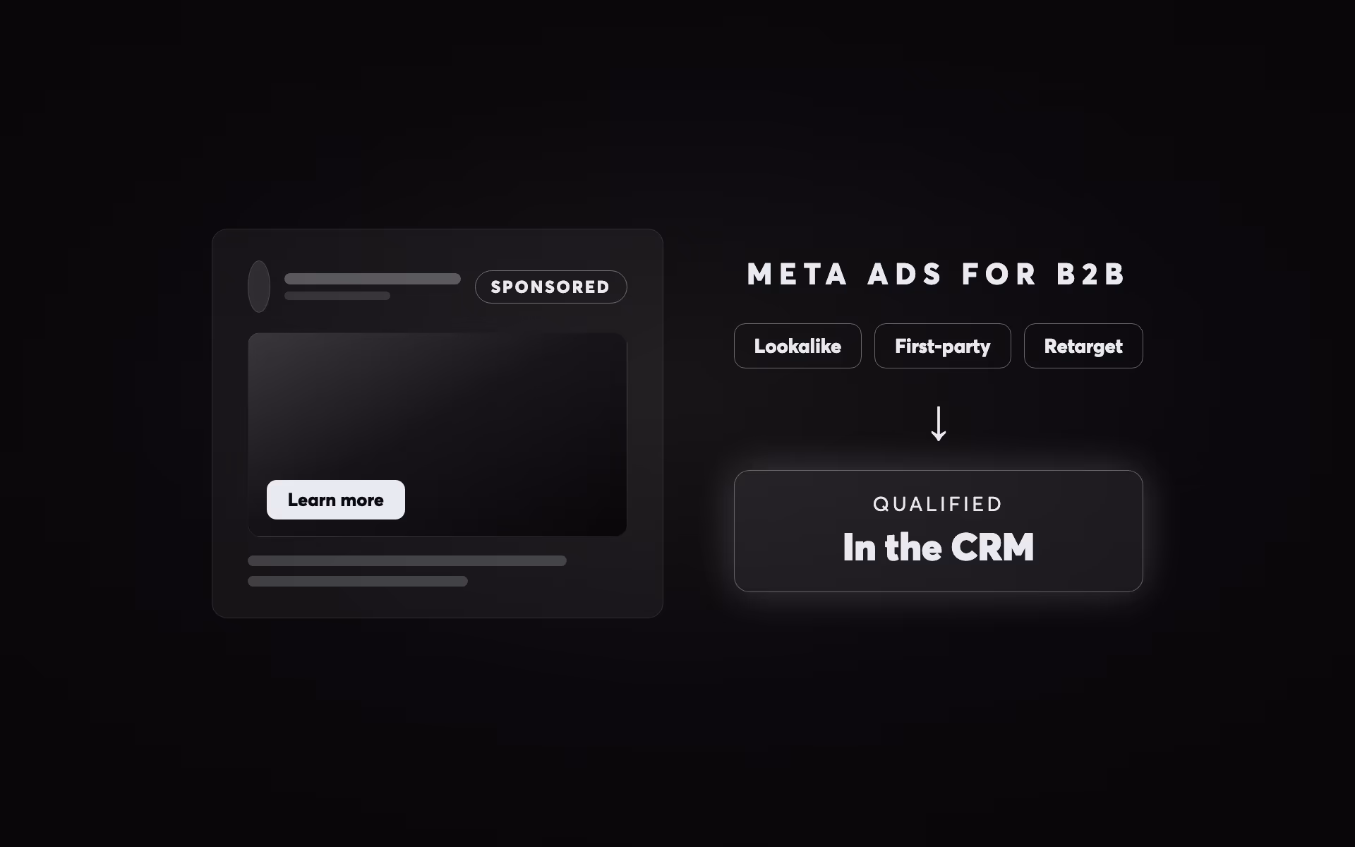
Meta Ads landing pages must acknowledge the interruption context. Unlike search traffic where visitors are actively looking, Meta traffic is interrupted during social browsing. Pages for Meta campaigns need stronger emotional hooks, more prominent problem articulation, and more extensive social proof — because trust needs to be established from a lower starting point. Video above the fold performs particularly well for Meta traffic.
Retargeting landing pages serve visitors who have already engaged with your brand. They've visited your site, watched your video, or engaged with your content — and now they're seeing your ad again. Retargeting pages should acknowledge the prior relationship, address specific objections (typically price, timing, and risk), and offer a lower-friction conversion action (a free consultation, a no-obligation audit) rather than a direct sale.
B2B high-consideration landing pages for complex services or large purchase decisions need to provide more content than a typical direct-response page. A decision-maker evaluating a $50K–$200K project isn't going to submit a form on a single-screen page — they need case studies, team credentials, methodology explanation, and risk reduction elements. For context on B2B digital strategy, see our guide on GEO for B2B and high-consideration services.
The CTA structure also varies by campaign type. For high-intent search campaigns, a direct "Get a Free Quote" or "Book a Call" CTA performs best. For awareness-stage campaigns, a value-exchange CTA ("Download Our Guide") or low-commitment CTA ("See How It Works") reduces friction. The offer in your CTA should be calibrated to the temperature of the traffic — hotter traffic can receive more direct conversion offers.
The 2026 Landing Page: AI, Personalisation, and What's Changed
The landing page landscape in 2026 has shifted in three significant directions from 2022–2023 best practices. Understanding these shifts helps you build pages that reflect current visitor expectations and technology capabilities.
First, AI-assisted content personalisation has moved from enterprise-only to accessible. Tools like Webflow's conditional visibility combined with UTM parameter capture can dynamically alter page headlines, hero images, and CTA text based on the traffic source, geographic location, or industry segment. This type of personalisation — which was previously only available to businesses with significant technical resources — now costs less than $100/month to implement. The conversion uplift from dynamic personalisation ranges from 25–68% depending on implementation quality and audience specificity.
Second, AI-generated copy testing has accelerated optimisation cycles. What previously required a skilled copywriter plus two to four weeks of testing to identify a winning headline can now be achieved by generating 20 headline variants with AI, scoring them against your ICE framework, and running the top three simultaneously. This doesn't replace copywriting expertise — it augments it by dramatically reducing the time and cost of generating quality test variants.
Third, video expectations have risen significantly. In 2020, a text-based landing page with good copy and a static hero image was competitive. In 2026, video on landing pages — whether a 60-second explainer, a talking-head testimonial, or a product demo — has become expected for higher-ticket offers. The 86% conversion uplift attributed to video makes it one of the clearest ROI investments in landing page optimisation. This is particularly true for B2B services where building trust before a consultation requires more persuasive work.
There is also an emerging intersection between landing page performance and AI search visibility. As generative engines like Google AI Overviews, ChatGPT, and Perplexity increasingly respond to queries with recommendations of specific businesses, your landing page content — and specifically the structured claims it makes about outcomes, social proof, and client types — becomes part of the content corpus these AI systems use to evaluate your credibility. This is covered in detail in our guides to SEO for AI search and generative engine optimisation.
Building Landing Pages in Webflow: The Practical Advantage
For businesses using Webflow as their website platform — or considering making the switch — the implications for landing page performance are substantial. Webflow's architecture delivers several native advantages over WordPress and custom-built sites that directly affect conversion rates.
Webflow's hosting infrastructure includes a global CDN with edge nodes in 195+ countries. This means your landing page assets are served from the nearest edge node to each visitor, dramatically reducing the load time that is, as documented above, one of the most impactful conversion variables. Webflow sites consistently score in the top 10% of page speed benchmarks, and their native image optimisation (automatic WebP conversion, responsive image generation) removes one of the most common causes of poor mobile performance without any developer work required.
The Webflow Designer enables rapid landing page iteration without code. Changing a headline, rearranging sections, adding a testimonial block, or testing a new CTA colour takes minutes rather than the developer hours required on a custom-built site. This speed of iteration is directly valuable for conversion optimisation — the faster you can implement and test changes, the faster you improve performance.
Webflow's CMS enables dynamic landing page personalisation through URL parameters and conditional visibility. Combined with tools like Finsweet Attributes or custom JavaScript, this allows large-scale campaigns to use dozens of audience-specific landing page variants without managing dozens of separate pages. The same design system and layout is shared; only the headline, hero copy, and specific social proof elements change per segment.
For an in-depth comparison of Webflow versus WordPress for business websites — including the maintenance, security, and cost implications — see our article on Webflow vs WordPress in 2026. For the broader context of landing pages within a complete website strategy, our complete website design and build guide covers the full decision framework.
The ROI of Getting Landing Pages Right
The business case for investing in landing page optimisation is straightforward to calculate. Consider a business spending $5,000 per month on Google Ads with 2,000 monthly visitors and a 2.5% conversion rate: 50 leads per month at $100 cost per lead. Improving conversion to 5% — well within reach for a page built with the principles in this article — produces 100 leads per month at $50 cost per lead. Same budget, double the output. Over 12 months, that's 600 additional leads without any increase in ad spend.
The compounding effect of systematic optimisation amplifies this further. A business that runs monthly A/B tests, implementing 2–3 improvements per quarter, can expect to reach the top quartile of conversion performance within 12–18 months. The businesses in the top quartile convert at 10%+ — four times the average. That differential, on a $5,000/month ad budget, represents hundreds of thousands of dollars of additional revenue annually.
CRO (conversion rate optimisation) delivers an average 223% ROI on investment, according to industry data — meaning every dollar spent on optimisation returns $3+ in increased revenue. This makes it one of the highest-leverage investments available to businesses running paid acquisition campaigns. The principles in this article provide the framework; the execution requires consistent testing, measurement, and iteration.
Ready to build a landing page that converts your paid traffic into predictable leads? Our Website Build Scoping tool helps you define exactly what you need for a high-performing website and landing page system. Start your website scoping session with Involve Digital.
Get Started Using The Form Below
This article is part of the Involve Digital website design and build guide. Related reading: Conversion Rate Optimisation: The Complete CRO Guide covers the broader methodology for systematically improving website performance, and our guide to Core Web Vitals and page speed covers the technical performance foundations that underpin landing page conversion rates.
Questions